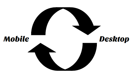
Just like everything on the internet, web design is constantly evolving. Years ago, we still thought it was pretty cool to have a cursor with bubbles coming out of it when you moved it, but those times are over now. With the introduction of mobile apps and websites, the web design revolution has started big time. In this article, we’ll tell you all about the so called ‘appification’ of the web and why mobile design is so important.
Desktop to Mobile
It all began with the introduction of the smart phone, which started getting people used to using the internet on their phones. At first, this was difficult, because you had to zoom in a lot, press tiny buttons and text links with your (too big) fingers, and if the website used flash you couldn’t use the website at all.
So web designers began to create mobile-friendly websites and apps, which were much easier to use on a small screen. They used big buttons, fewer text, more graphics and clean, simple interfaces that didn’t need any zooming in. In addition, some totally new functions were added, such as sliding and swiping to navigate (rather than using a vertical scrolling bar).
Mobile to Desktop
Where web designers first took the desktop website and adapted it to fit a smaller screen, now it happens the other way around. You might not have noticed this, but mobile web design is affecting desktop web design hugely. That’s no wonder, because mobile internet use is growing at a fast pace and will probably take over desktop internet use by 2014. This means that people are getting used to surfing the internet on their phones. They are getting so used to this simple and easy experience that the old desktop designs seem to have too much going on now.
Web designers are adapting to this and are now using cleaner and simpler designs for their desktop websites too. If you look at some popular websites you’ll see they often have little text, big buttons, lots of graphics and even sliding functions. Hmm… What could have inspired them?
Responsive web design / Mobile design
A perfect way of bringing desktop and mobile web design together is by using responsive web design. This means your website will adapt to different screen sizes to always keep the website user friendly. What doesn’t change though is the user experience. It’s always clean, simple and easy to use. If you want to know what we mean, look at this website we did for Hotel Indigo Berlin on both your desktop and your tablet/mobile phone: http://hotelindigoberlin.com/
Alternatively, you can view the site in a standard desktop browser. When you resize your browser, you can see the website respond to that resolution before your very eyes. Responsive magic!


