No I am not going mad, and no this is not one of my healthy eating ideas followed by a recipe for the perfect pancake batter.
During a recent marketing meeting to brainstorm ideas at one of the businesses I work in, I started getting a little frustrated with the team. They had come up with a really good concept for referring a set of partners to a different part of the organisation, but when it came to coming up with the content for the material for the referrals, well quite frankly, there was too much waffle!!
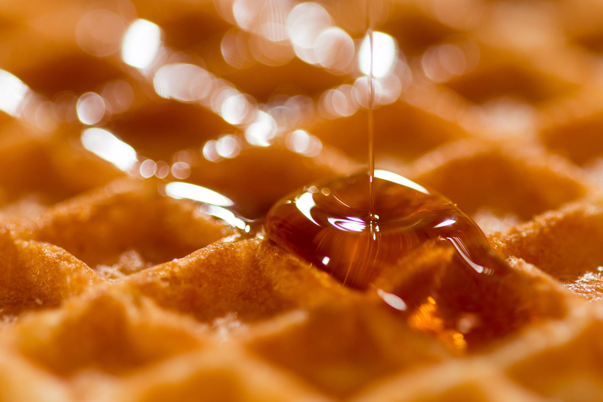
Waffles are delicious but are a bit complicated to make. Similar batter to a pancake but you need a waffle iron or machine. It is a complex structure when looking at it, and it is also a bit of a hassle. A pancake, on the other hand, is quick and basically a simple circle. This , I believe is the essence of good marketing, keeping it simple.
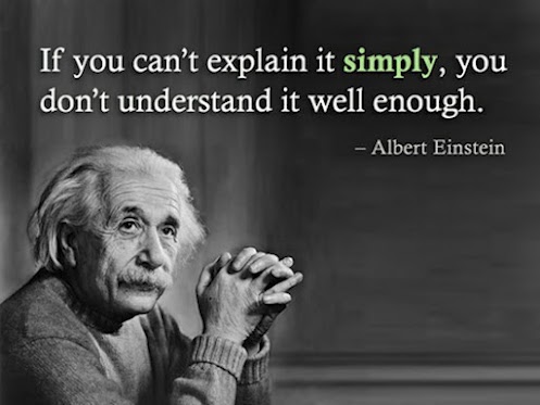
The old adage is so very true . KISS . Keep It Simple Stupid and I think this is even more important in today’s age of low attention spans, mobile devices and a million and one advertisements being thrown at people through multiple channels as long as people are awake (although I am sure my Iphone sends me signals in my sleep!).

Credit – http://berk.es/
Whether it is a website, a Facebook advertising campaign or an advert on a tube, I really believe that less is more when you want to relay your message across in a simplistic manner. Content with visuals that are both eye pleasing and to the point, grab people’s attention so much quicker than text heavy pieces of content. These text heavy pieces of content either have no visuals, or have visuals that quite frankly put people off rather than make them engage in one way or another with the product or company being marketed.
When it comes to websites, and the fact that sites should be multi device friendly, it is essential to deliver a message that is to the point and engaging whatever device a potential customer is on. You often hear people say “Content is King” when it comes to SEO/website optimisation; this is true, but content doesn’t have to be a “load of waffle”. It can be simple, punchy text rather than an essay (says the man writing one now, but if you are reading a blog or Linkedin Article, you expect it!) and photos that tell you a story (are appropriately tagged for SEO purposes) rather than photos that send you to sleep (i.e. a Sink Tap in a hotel bathroom on the homepage of a website!) .

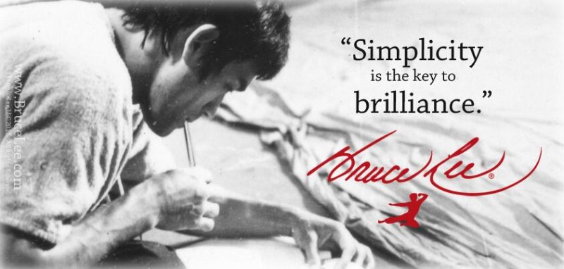
Credit: www.BruceLee.com
I believe this theory is applicable across industries but it is so important in travel and hospitality. “Selling the experience” is something that needs to be done the minute customers engage with your brand. As I wrote in a previous article , and something I have thought for a while, is that people, especially digitally engaged consumers (this is not an age related point but a mentality and lifestyle demographic) are nowadays craving an experience. When they engage with a brand, especially in my passion of Hospitality and Travel, they want to know the brand they are engaging with, whether it is a restaurant, hotel or travel company, is going to give them an “experience” to inspire them. There are obviously products and brands that are more functional, but without going to experiential, they still need to sell that idea of their functionality, price or whatever their USP is, WITHOUT waffling.
There are some great examples of the power of simplicity ;
Nike . “Just do it”
Mc Donald’s – “I’m Loving it”
One of Apple’s slogan back in the day – “Think different”
The problem with some of the older hotel and travel brand consortia now is that they have so many brands, that it is really difficult to sum them up in a few words. But look at the more modern hotel/travel brands.
Citizen M – “affordable luxury for the people”
Expedia – “Where you book matters”
Generator Hostels “More than a hostel”
So, in summary, when you are next in a marketing meeting or pulling together a powerpoint to show off your product or brand, think less rather than more. Think about KISS and REALLY make sure you are making a pancake and not a tray of waffles!


